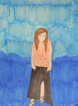
Glamorous Dress
Materials: prismacolor, sharpies, water color paint
2017
Drawing
|
The thing that inspired me to make this was the love I have for fashion. To make this project I used a picture of me wearing a dress and heels. For my coloring I used these markers called "prismacolor" because they were really thick makers that really gave details into the color (I only used them for the background, the top color of the dress, and the skin color). For the bottom of my dress I used a regular black sharpie because it defined all the lines throughout the dress so that it didn't just look plain. Lastly I used this sparkly, metal look paint for the gem/ sparkly look effect because on the actual dress, that's what it is. To me I think of one of my pieces from last year when I designed a similar dress to which my sister had on for modeling.
|
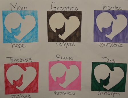
She didn't do it alone
Materials: Various colors of sharpies, scissors, big poster board
2017
Drawing
|
The thing that inspired me to make this was the support everyone has given me throughout my life and because of that I am thankful for each and every person. To make this project I had regular drawing paper and cut it into a near looking square and began to draw the face inside the heart on each. From there, I used different color sharpies for each to color in (I tried my best matching the color of the sharpie with the persons' favorite color). I then got a big poster board and glued on the square pieces to the bigger paper and cut off the extra pieces to make it more even. When I look at this I automatically see the face inside the heart but lots of people had trouble at first and looked at it as if it were some type of illusion. |
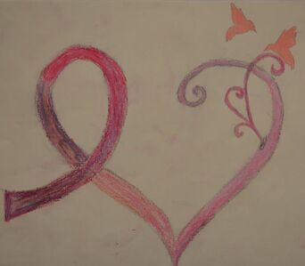
The Journey
Materials: Oil pastels, colored pencils, drawing paper
2017
Drawing
|
The thing that inspired me to make this was what has been going on with my mom recently and finding out that she is in stage 4 of breast cancer. To make this, I first traced the outline of what I wanted to have it look like with pencil, then I I used a few different oil pastels and slowly went with a flow to show the effects/differences throughout the sign. Since the oil pastels are not that easy to control, I used a pink colored pencil to fill in the little branch like thing on the side and the birds on the top. When I was making this, I was intending to make the cancer sign a pathway (bad~good). I wanted to show that even though my mom is going through a tuff time now, things will get better and everything will be okay. |
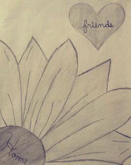
Feels Like Home to Me
Materials: 6H and HB drawing pencils, a needle point sharpie, drawing paper
2017
Drawing
|
The thing that inspired me to make this was the questionable thought that keeps going around my moms head which is whether or not we will move or not. It might not add up to anyone until I fully explain why I made a daisy and put the word "home" in the central of the flower. I live on Daisy Lane and put the word "friends" inside a heart indicating that I'd miss all my friends if I were to move. To make this I used my drawing pencils (6H and HB) a basic piece of drawing paper and a needle point black sharpie. I referred back to when we didn't use the different types of values in one pencil while I was shading in the pedals. I believe that I really tried going into detail with the pedals by putting lines through them instead of having plain pedal looking things without anything making them look realistic. |
